Websites
We typically use websites to find information. Therefore the site must welcome the reader and be user friendly. Landing on a website that causes confusion or takes too much time to find the desired topic will cause the customer to move on to an easier site to maneuver.
We think a website should be simple and concise. The presentation should be pleasant and not too busy (distracting). Your branding should be top-of-page and evident. The purpose should be clear and the tone complementary. The page should load fast and have a consistent design. It should include current and/or relevant information and links should all work. The content should keep the interest of the visitor and invite the visitor to do something before leaving the site (like sign up for a newsletter or blog allow for the collection of their contact information).
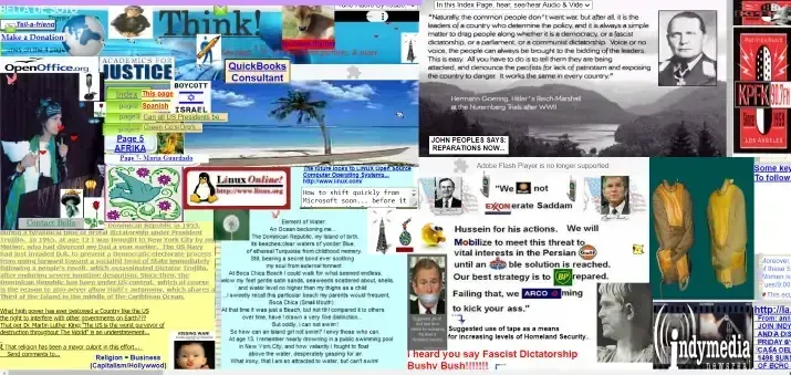
Confusing Sites
Too much causes the audience to get distracted. Often they forget what they were even looking for. This is an obvious example of too much.
We believe less is more and will focus your customers attention to your brand and to the point.

Our commitment to our clients...
Mission
Satisfied clients
Our goal is to solve marketing problems for our clients so their attention can be on the customers.
Quality
Fulfilled expectations
Our commitment is to deliver the product and results the client expected.
Mindfulness
Financial
Strategic spending to reduce risk and achieve best results for our clients.
513-822-4102

Let's secure your game plan!

